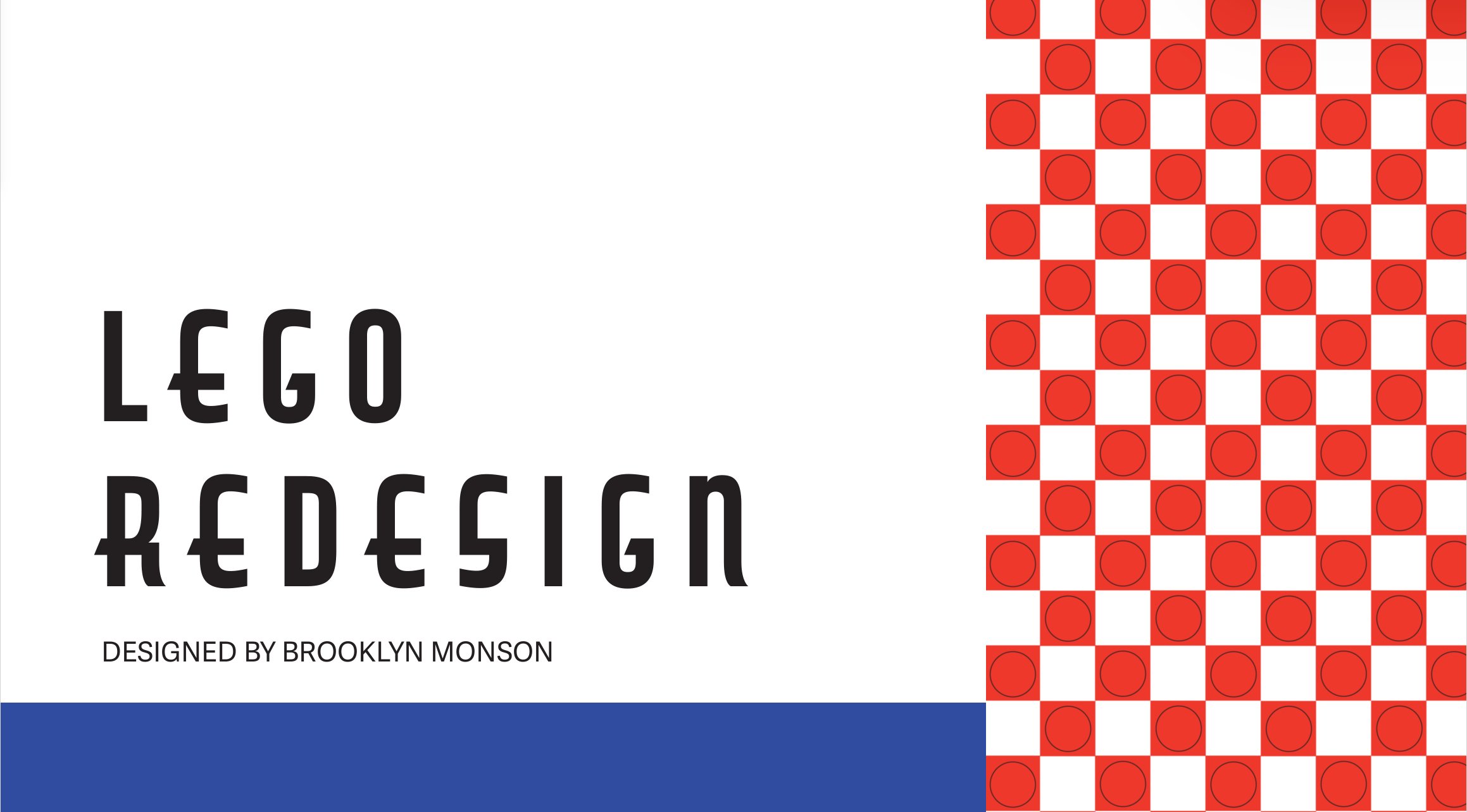
LEGO Rebrand Project
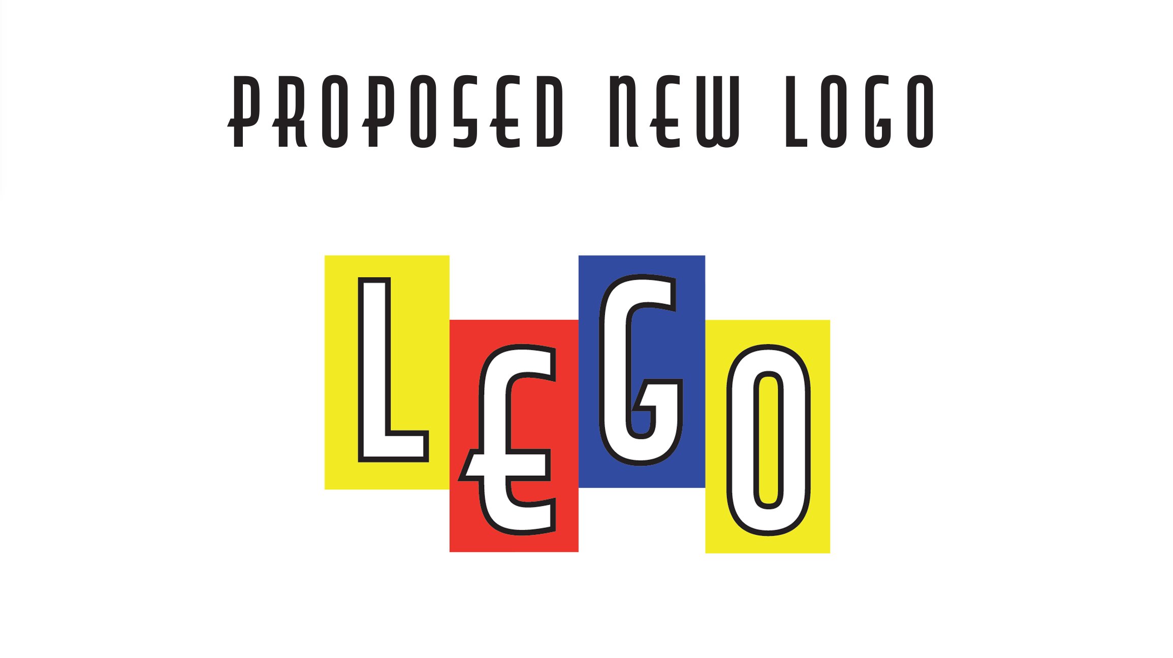
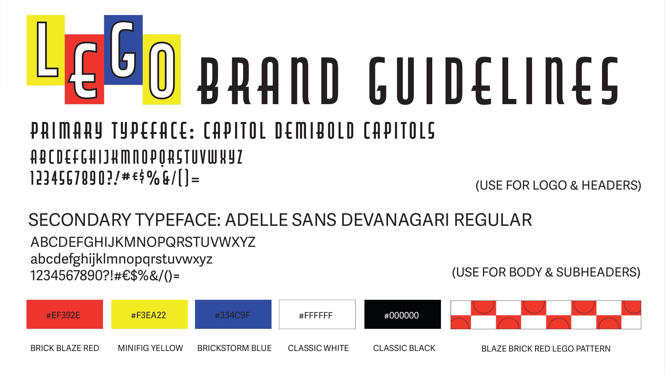
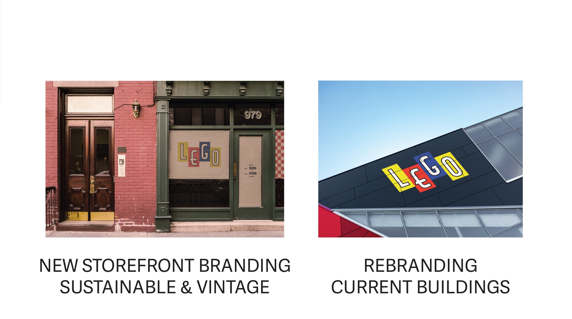
For this school project, I reimagined the LEGO brand with a focus on sustainability, inclusivity, and a nostalgic nod to its iconic history. Drawing inspiration from LEGO’s 1960s design style, I aimed to capture the vintage charm of the era while modernizing the brand to appeal to today’s diverse audience.
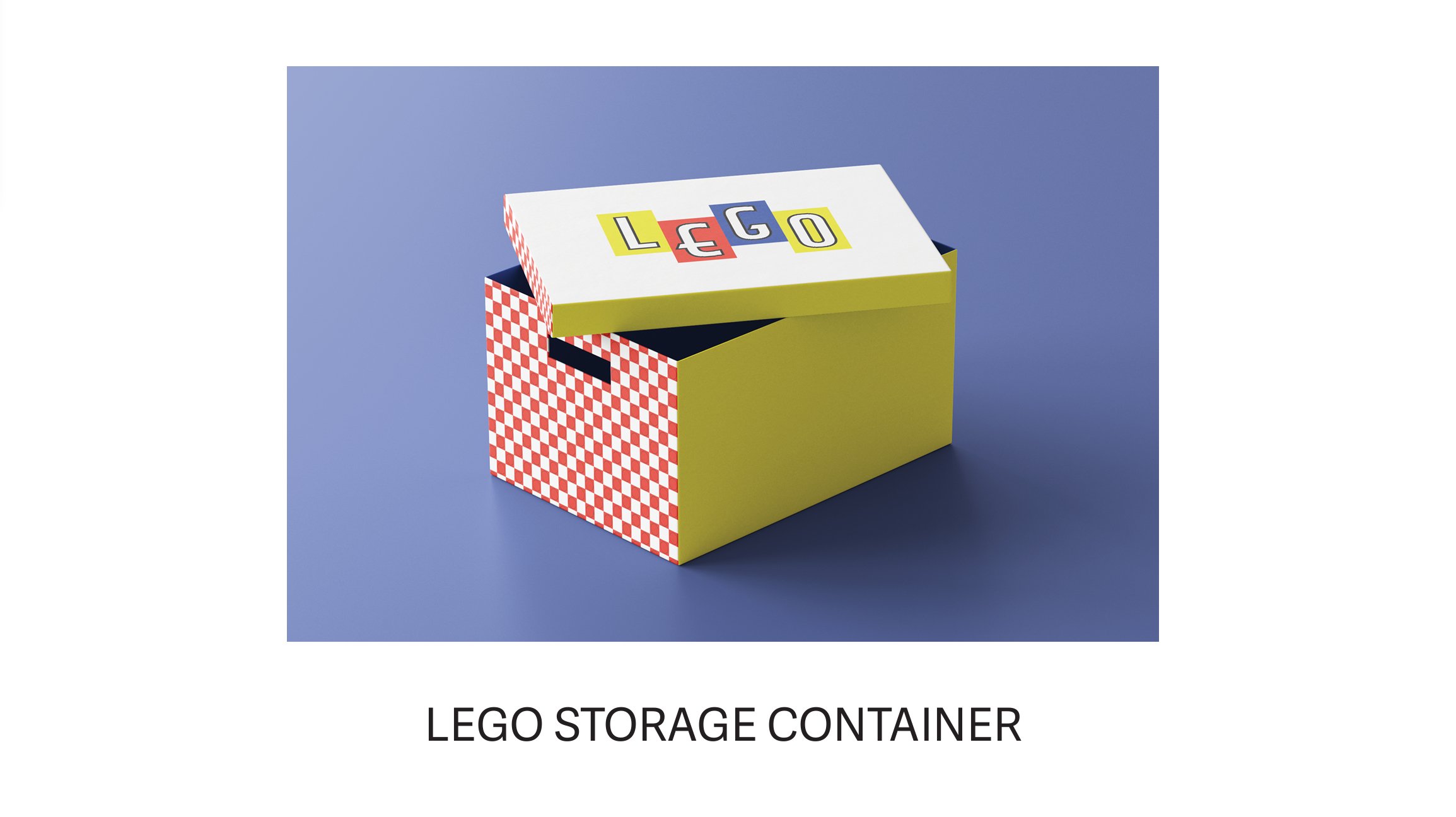
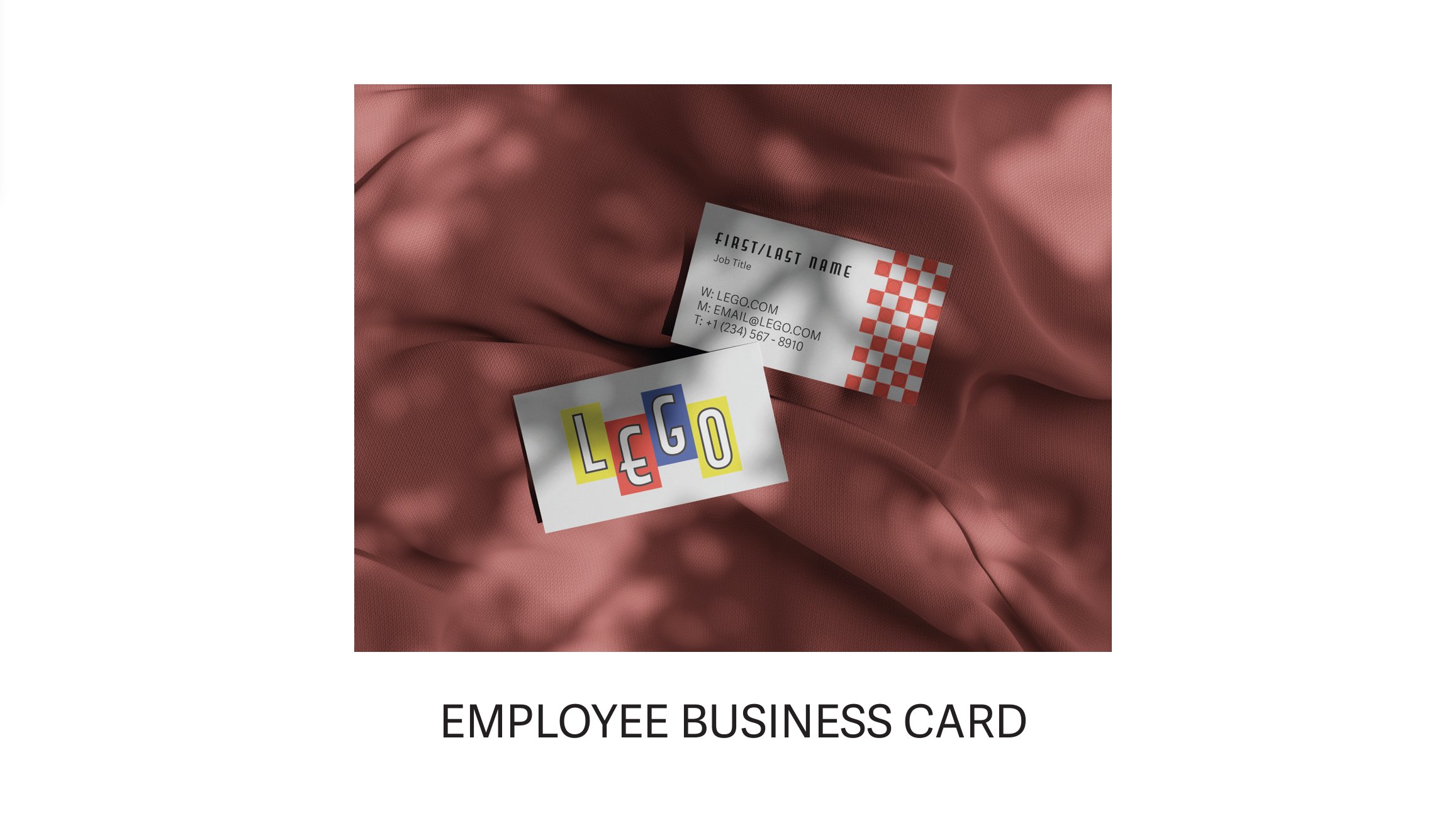
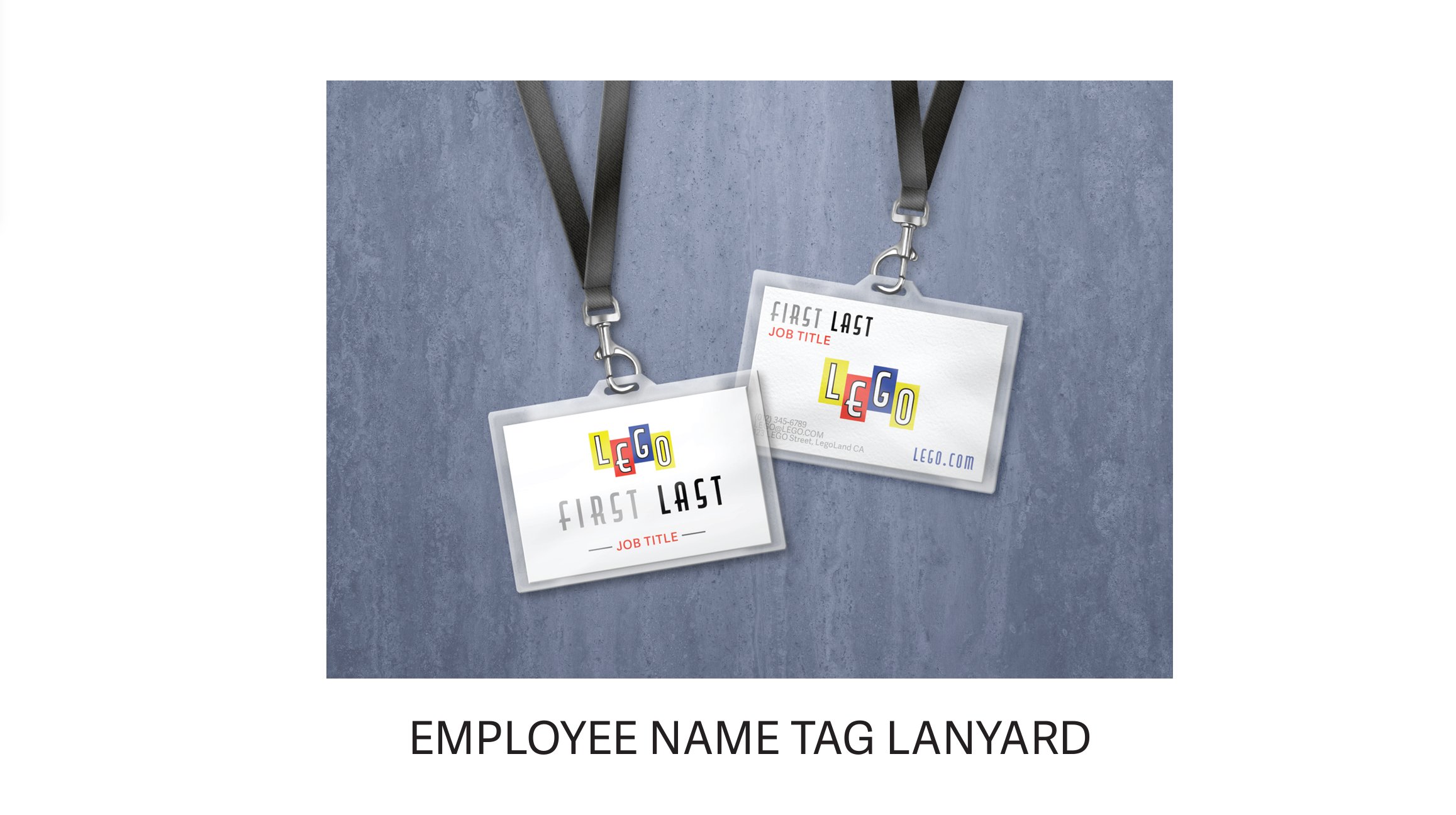
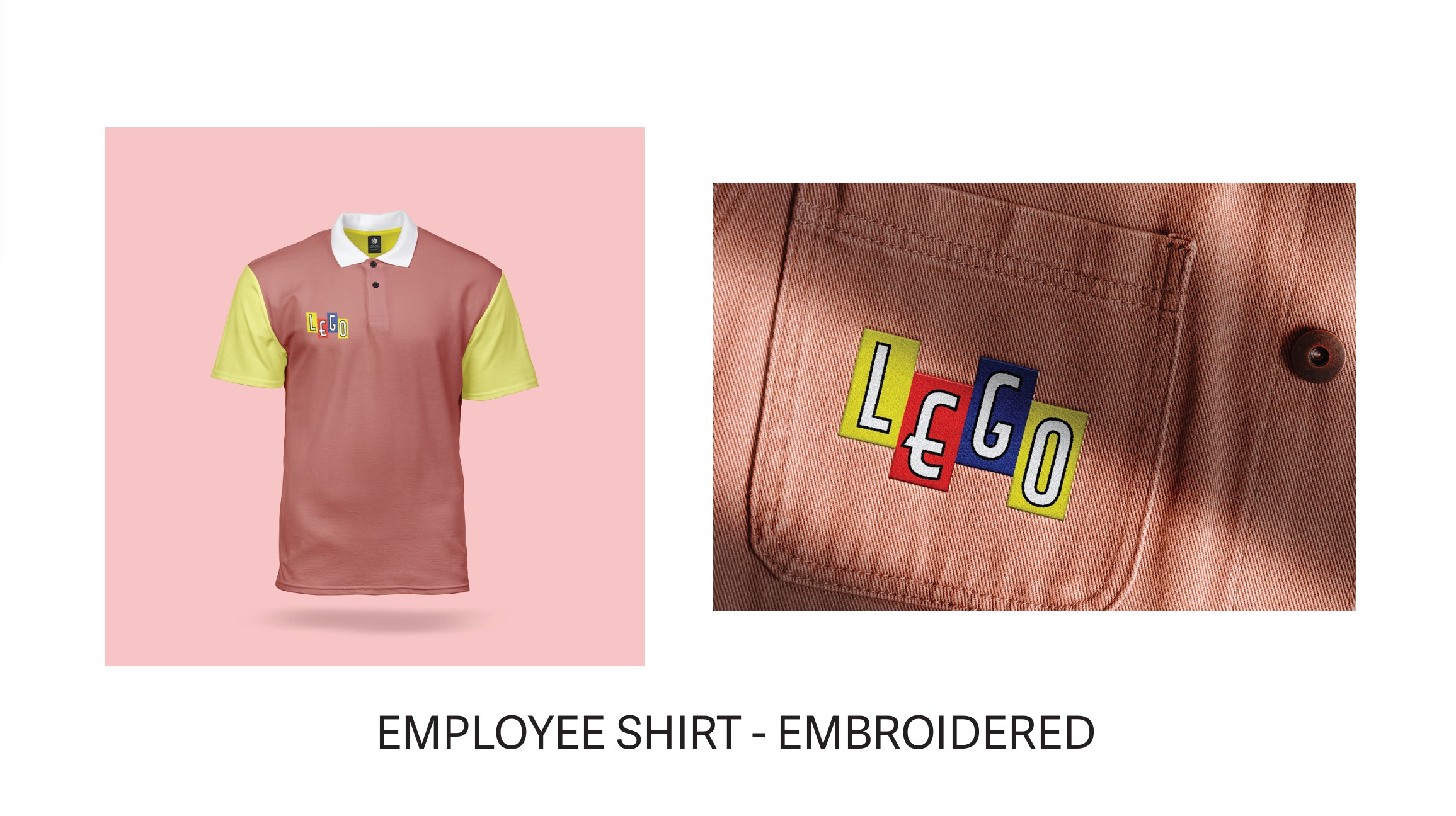
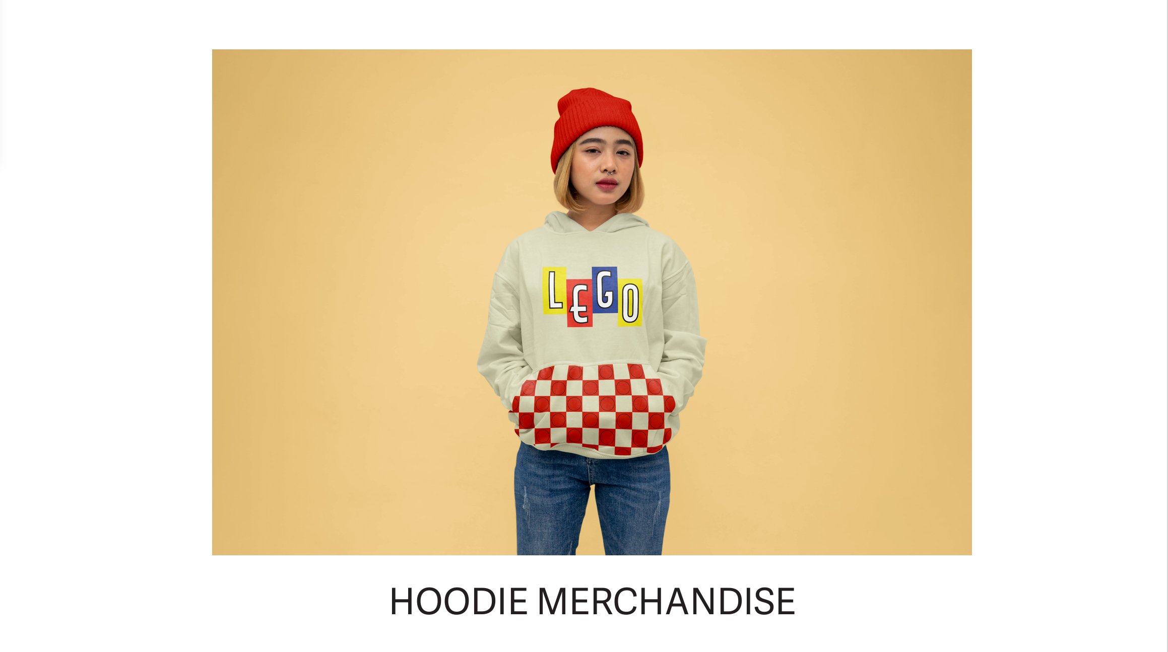
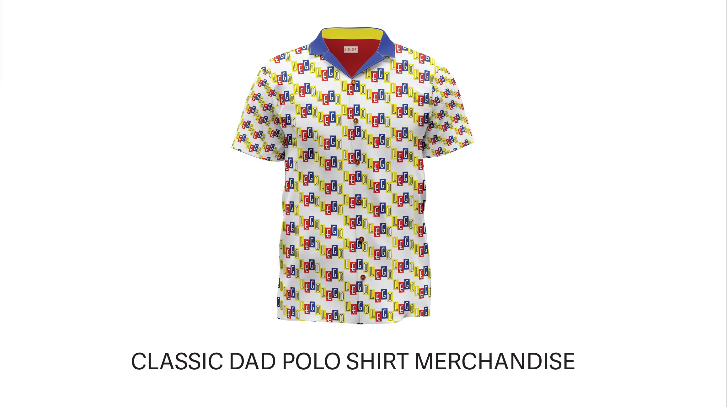
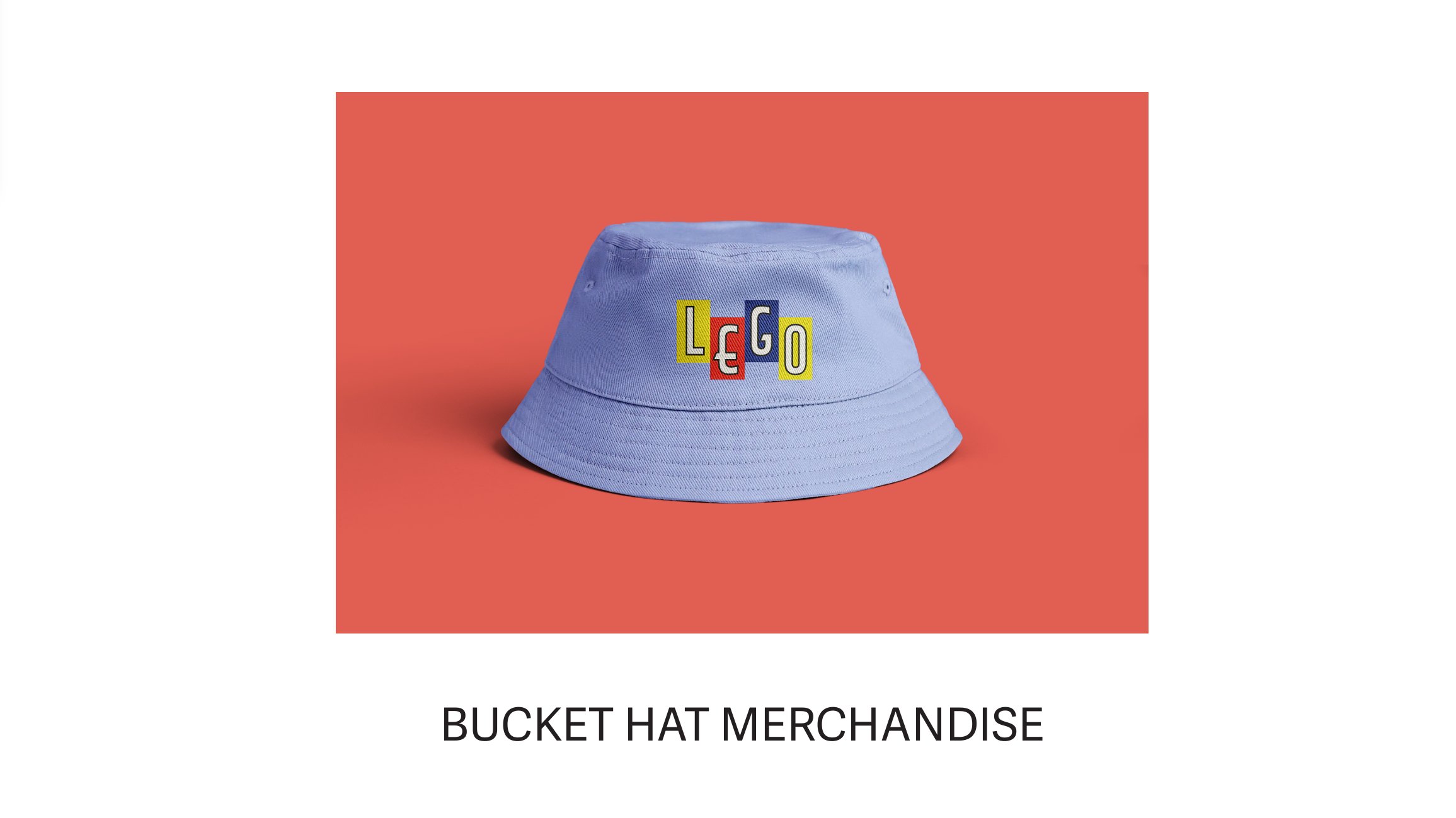
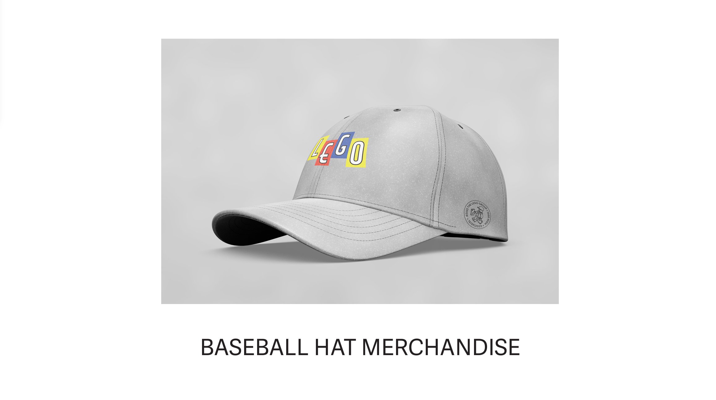
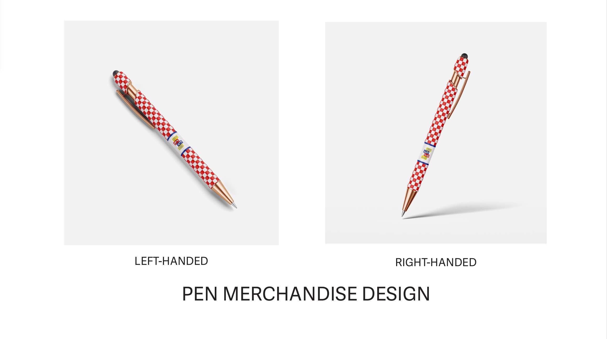
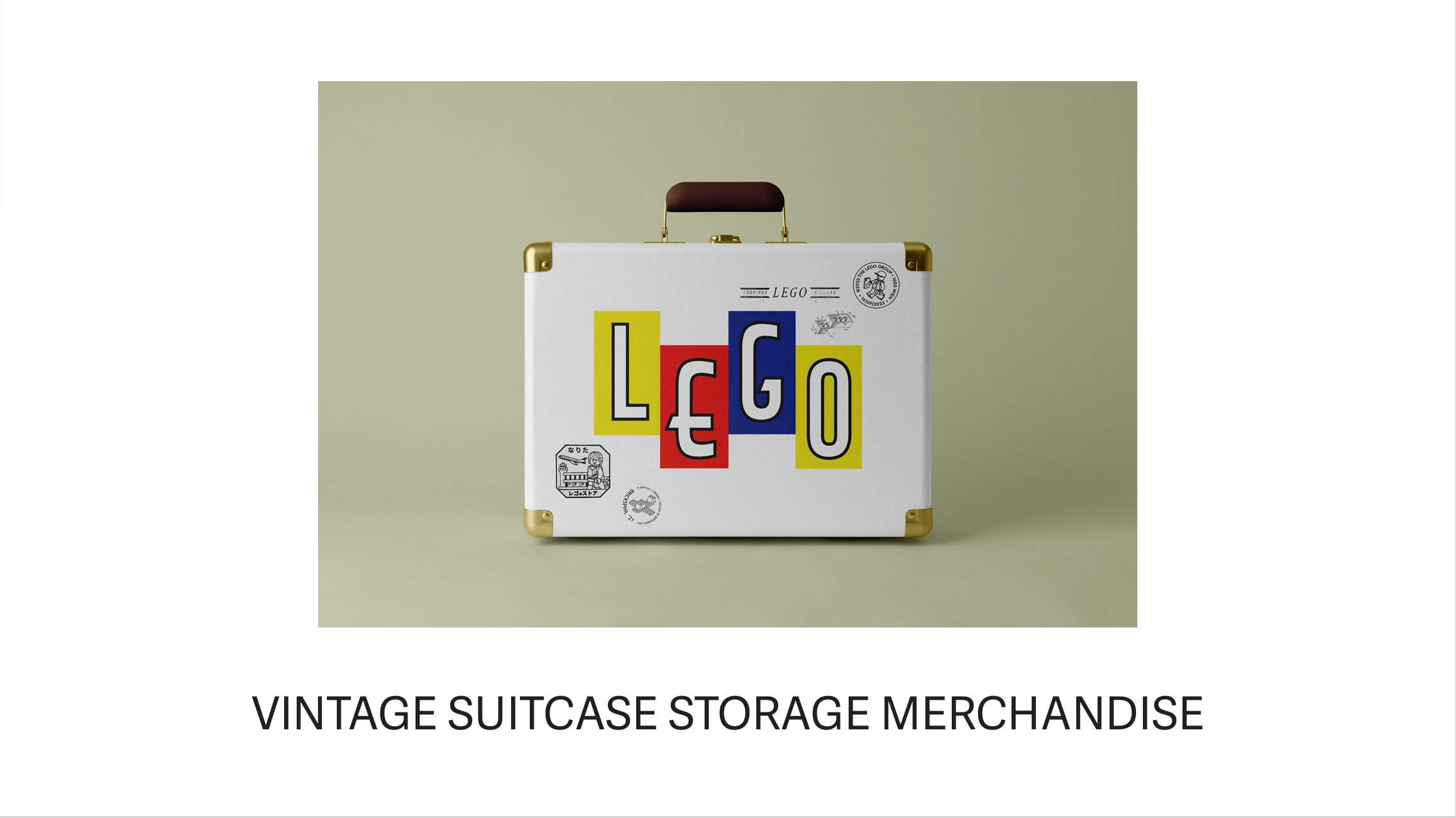
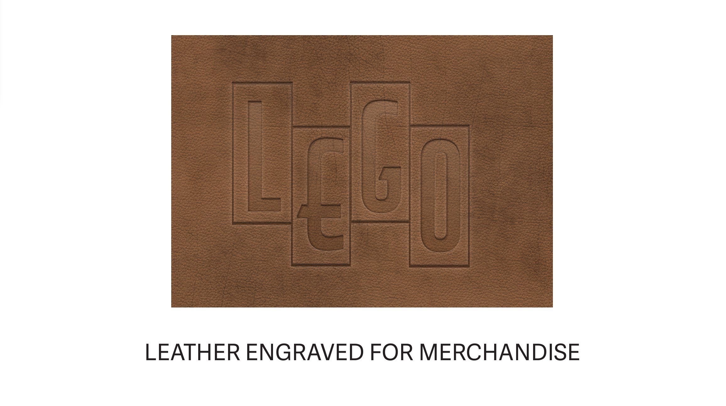
My designs emphasized checkered patterns and bright, bold colors drawn directly from LEGO’s classic block palette, paired with references to previous logos to bridge the brand’s rich heritage with its innovative future. Sustainability was a key focus, aligning with LEGO’s commitment to eco-conscious practices and ensuring the designs reflected a responsible and forward-thinking approach.
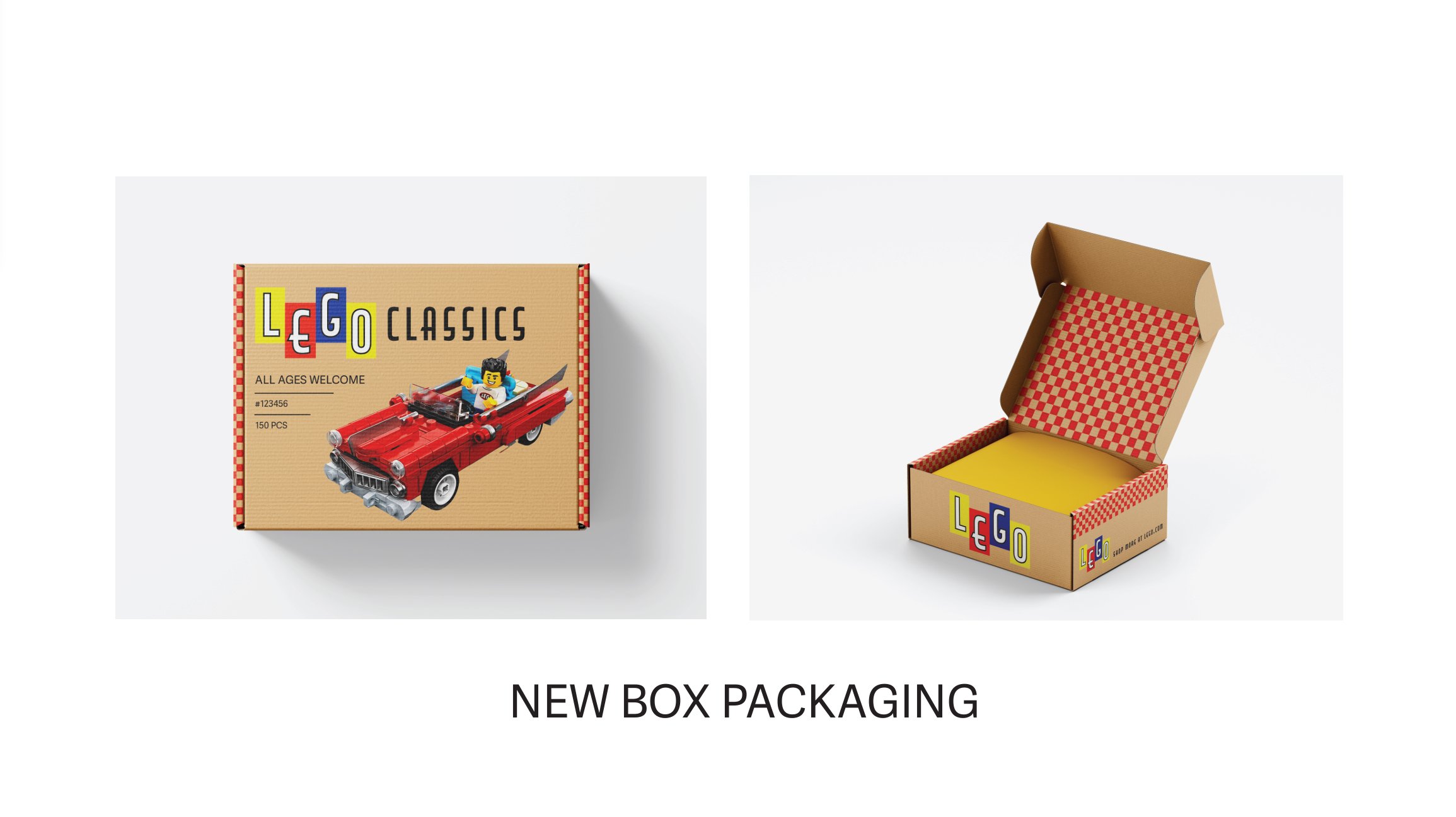
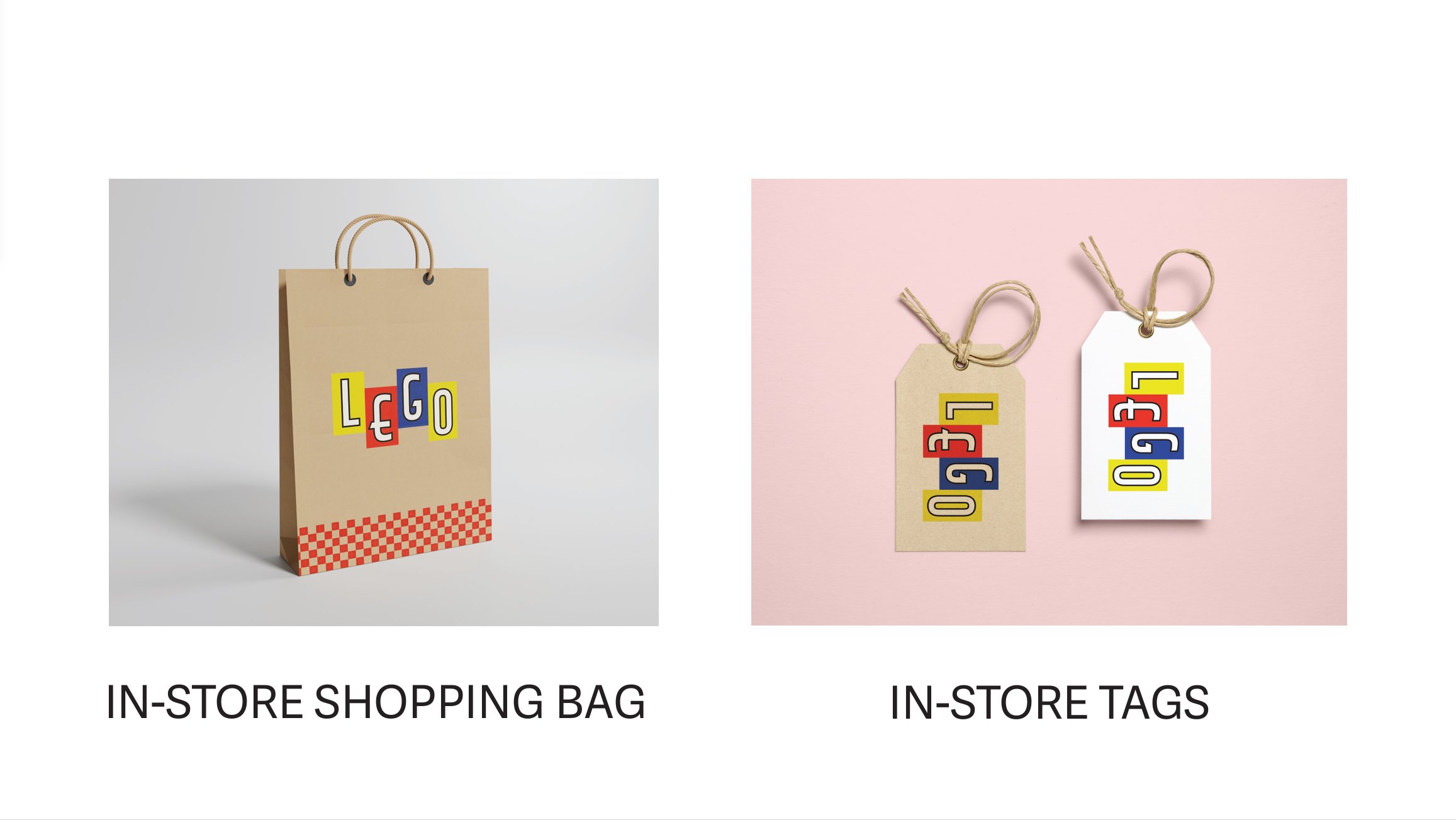
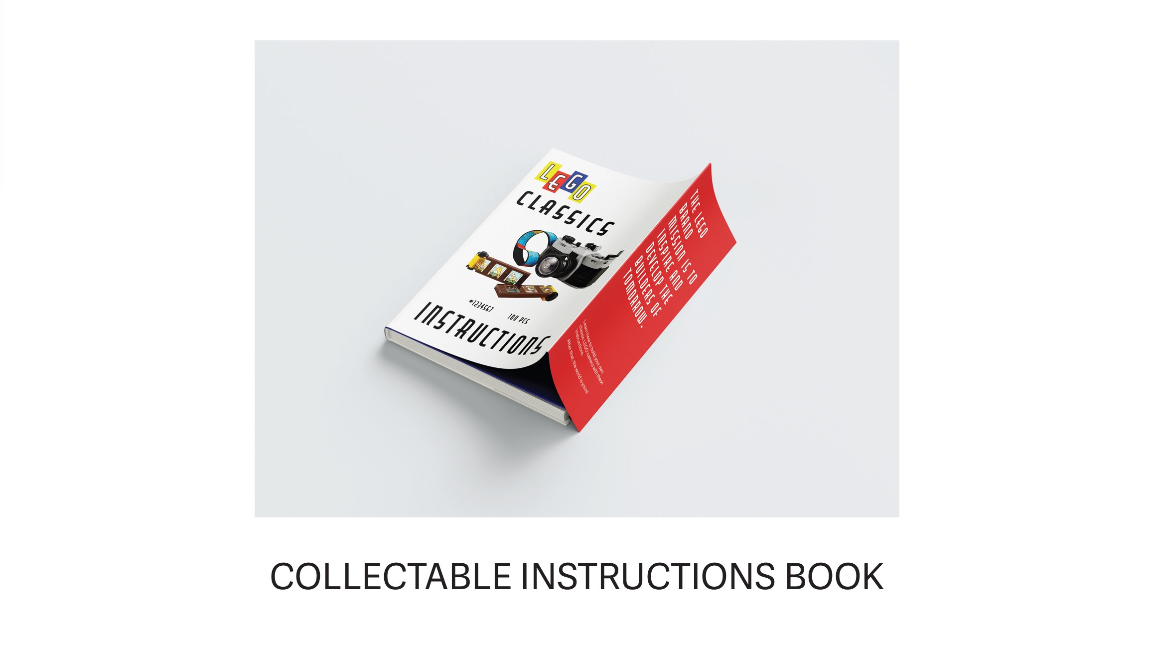
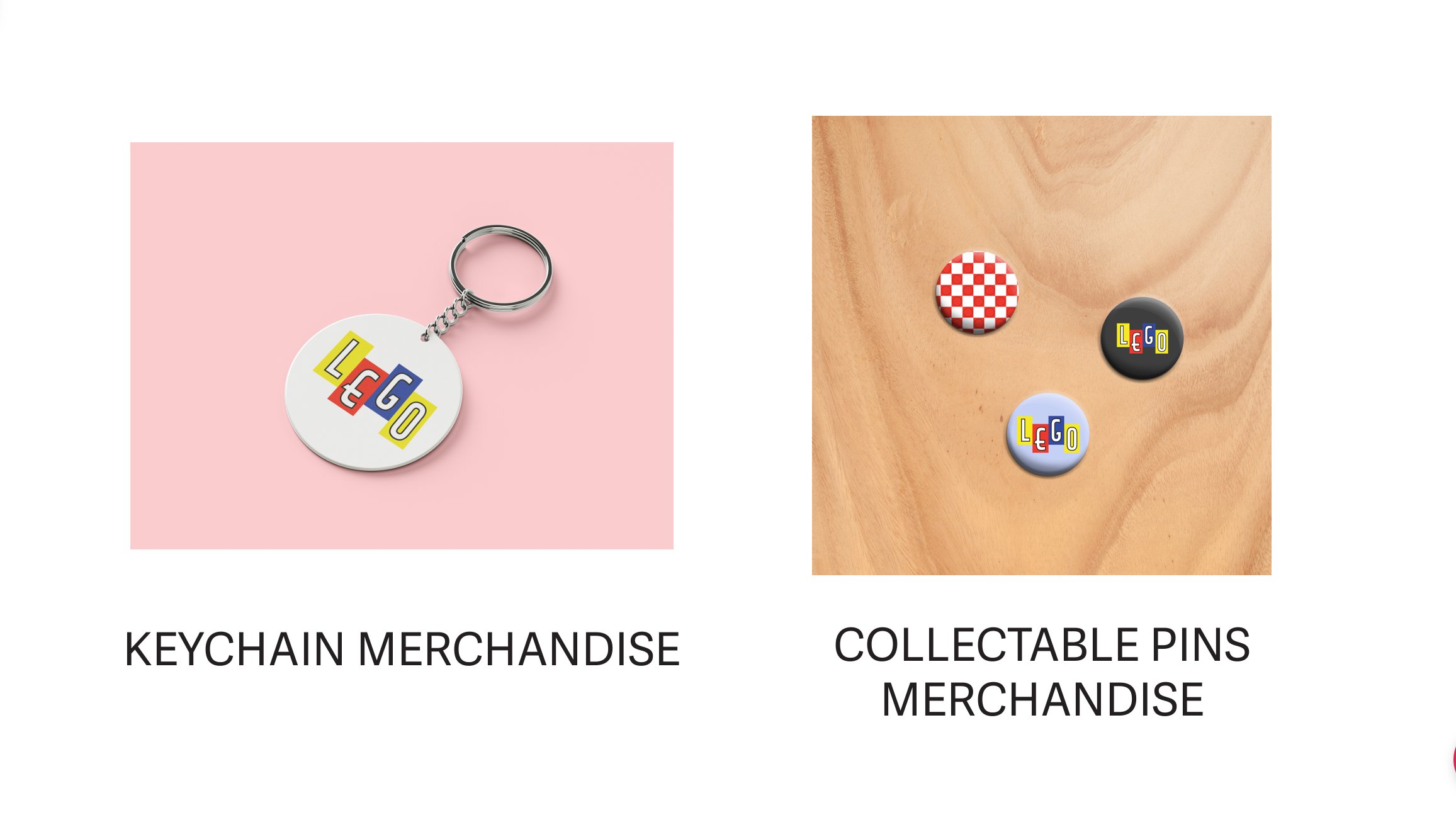
Additionally, I wanted to position LEGO as a brand for all ages—not just for children but also for adults. My concept introduced collectible items such as beautifully designed instruction books, organizing boxes, and vintage-inspired suitcases. I emphasized inclusivity, envisioning a wide range of products that cater to diverse interests, hobbies, and age groups, creating a truly universal appeal.
This project allowed me to explore the balance between tradition and progress while celebrating LEGO as a brand that builds connections, creativity, and community for everyone.
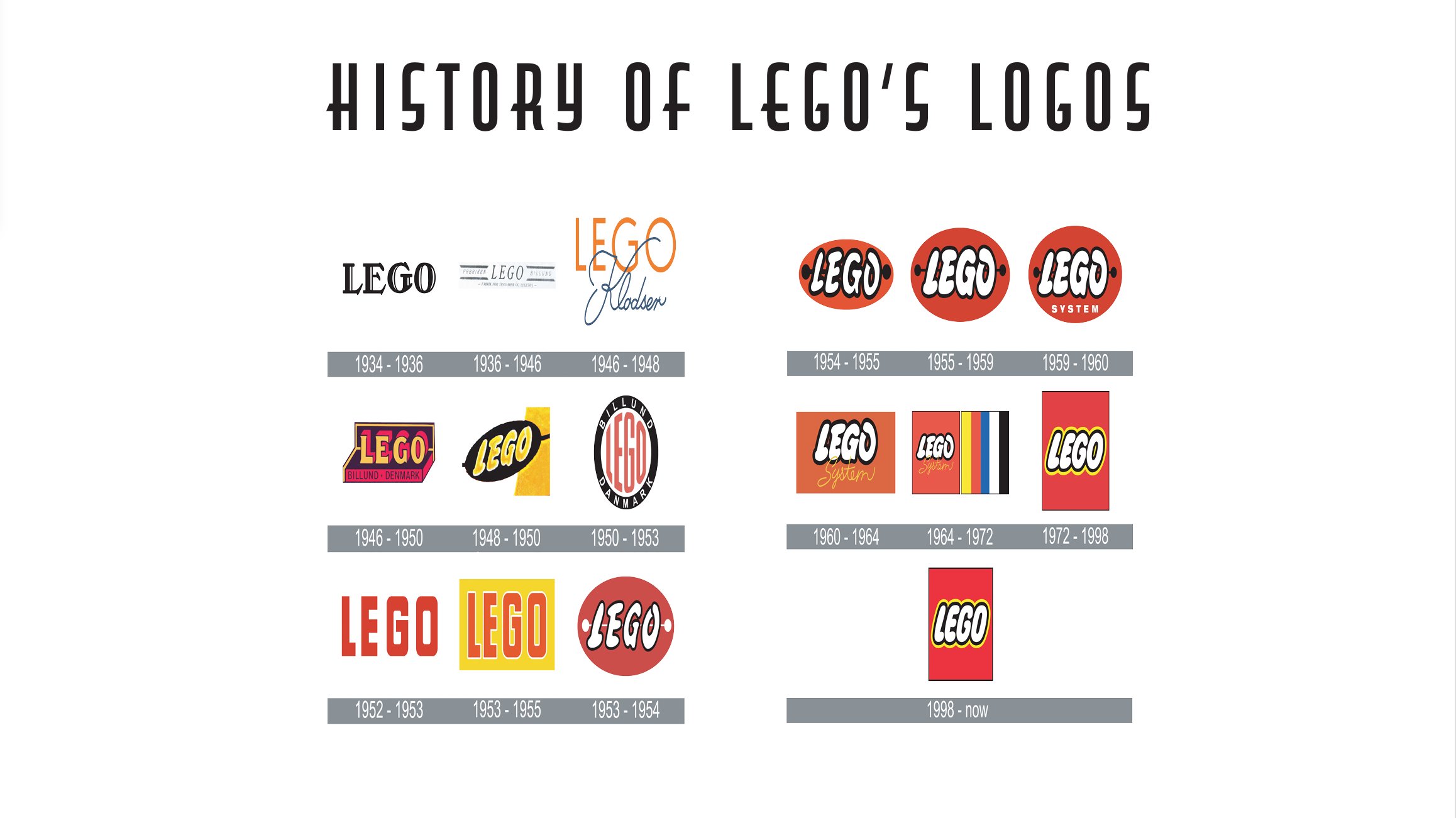
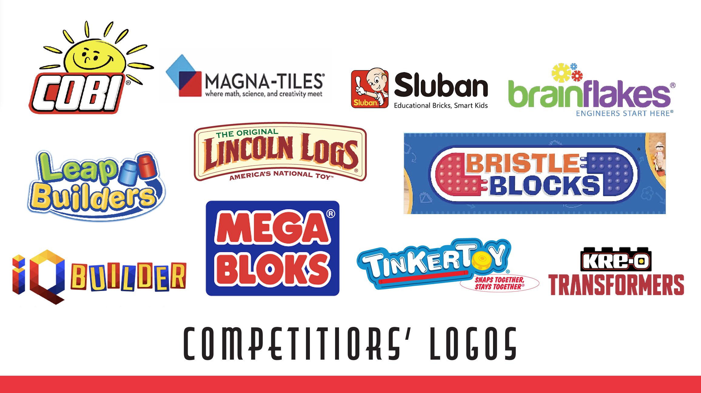
NOTE: All previous LEGO logos referenced in this project are not my original designs and are the intellectual property of the LEGO Group. Additionally, I would like to clarify that COBI, Magna-Tiles, Sluban, Brain Flakes, LeapBuilders, Lincoln Logs, Bristle Blocks, IQ Builder, Mega Bloks, Tinker Toy, and KRE-O Transformers are not affiliated with my work and remain the intellectual property of their respective companies. This project was created solely for educational purposes and as part of a school assignment.